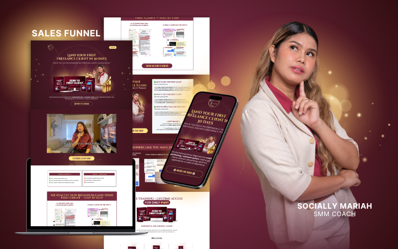
VirtuaLearn — Sales Funnel Redesign
Client: Socially Mariah (SMM Coach) — Turning visual clutter into a smooth, high-converting visual journey for VirtuaLearn's 'Land Your First Freelance Client in 30 Days' sales funnel.
The Philosophy
Most people think a funnel just needs to “look good.”
But pretty without strategy is just decoration. 👀
For this project, I redesigned the sales funnel for VirtuaLearn by simplifying the experience and creating a smoother visual journey from section to section.
The old funnel had too much visual clutter, making it harder for visitors to focus and take action. So instead of just redesigning the aesthetics, I rebuilt the flow with conversion in mind:
✨ Cleaner structure ✨ Better section separation ✨ Stronger visual hierarchy ✨ Easier content digestion ✨ A guided experience that leads people to the CTA naturally
Because a high converting funnel isn’t about adding more.
It’s about removing friction. 🟢🧡
VirtuaLearn Sales Funnel Transformation: Featuring Socially Mariah, SMM Coach — 'Land Your First Freelance Client in 30 Days' training.
The Challenge: Visual Clutter vs. Conversion Clarity
VirtuaLearn's offer had proven value and real student success stories, but the legacy funnel suffered from visual friction:
Too many competing elements, irregular section transitions, and inconsistent brand cues made it difficult for aspiring freelancers to follow the core pitch and complete registration.
Our mission was to craft an elevated, authoritative visual system that honors Socially Mariah's coaching identity while engineering a seamless path straight to the checkout button.
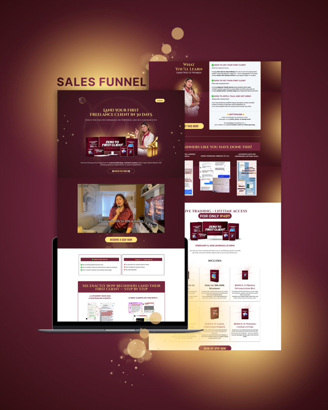
Complete Sales Funnel Architecture: Desktop structure, student proof stacking, video embed, and risk-free offer breakdown.
Strategic Execution: Rebuilding the Journey
We reorganized the funnel with five deliberate conversion principles:
- Cleaner Structure: Distinct, high-contrast content blocks that guide the eye naturally down the page.
- Better Section Separation: Generous negative space, rich wine-toned gradients, and gold-metallic highlights that feel premium without distracting.
- Stronger Visual Hierarchy: Headline-first typography with clear value callouts, so visitors grasp the transformation in seconds.
- Easier Content Digestion: Transforming dense course curriculum into visual feature cards, proof carousels, and bonus breakdowns.
- Frictionless CTA Flow: Strategic reserve-a-seat triggers placed at natural decision moments throughout the page.

Brand & Product Presentation: VirtuaLearn brand emblem paired with modern smartphone mockup presenting the responsive mobile funnel.
Bonus Pack Mockup & Offer Stacking
A high-converting funnel needs tangible perceived value. We engineered custom 3D bonus mockups for the entire training stack — including Canva Portfolio Websites, Interview Scripts & Guides, Zero to 30K-100K Roadmap, Profile Optimization Bot, and Winning Cover Letters — anchoring the perceived value far beyond the enrollment price.
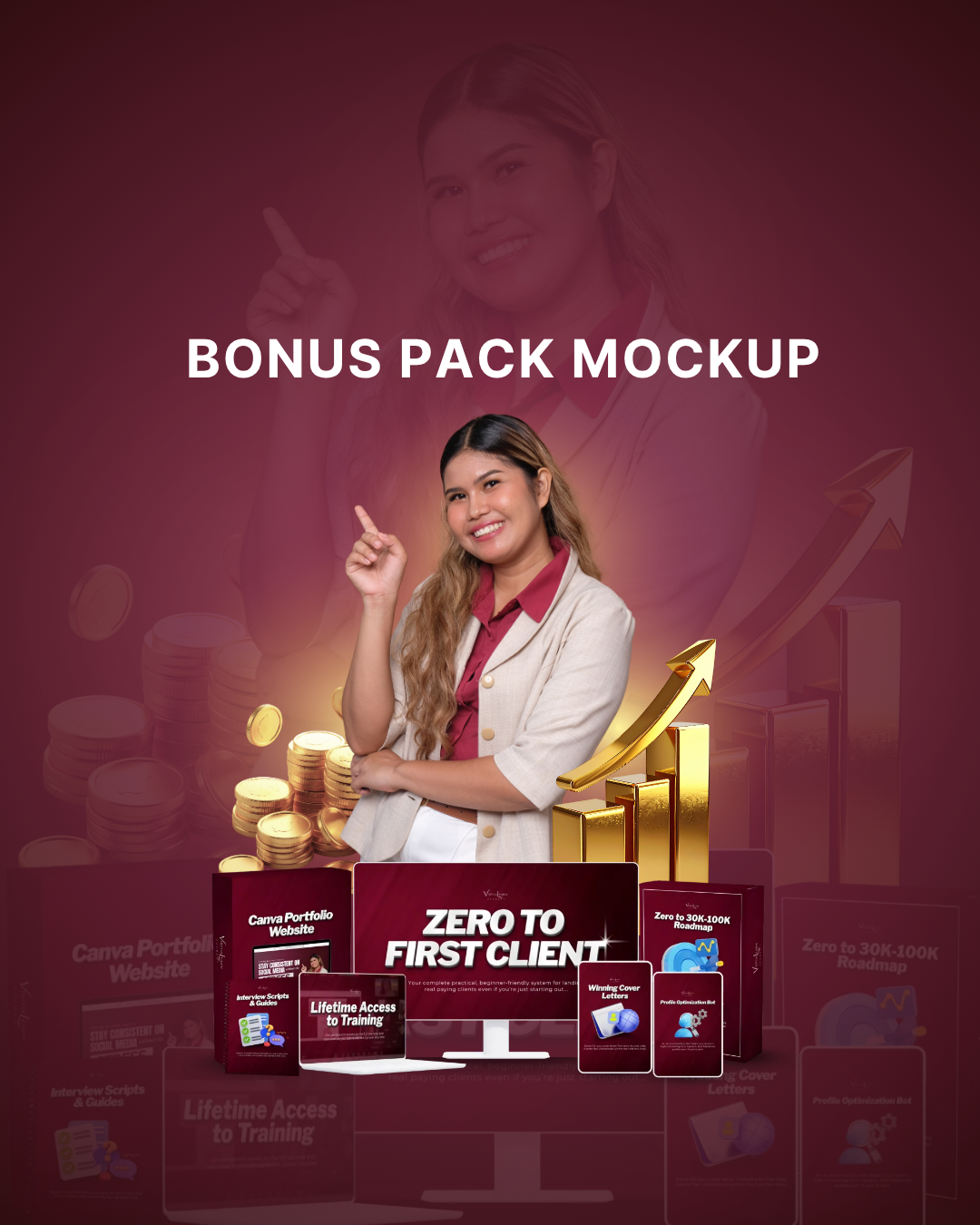
Bonus Pack Mockup: Premium visual assets illustrating each bonus in the Zero to First Client ecosystem.
Mobile-First Conversion Experience
Over 80% of Socially Mariah's audience discovers her content via social media reels and stories. We engineered the mobile layout to feel like a native application — rapid load speed, thumb-friendly buttons, high-legibility typography, and collapsible FAQ accordions that prevent endless scrolling fatigue.
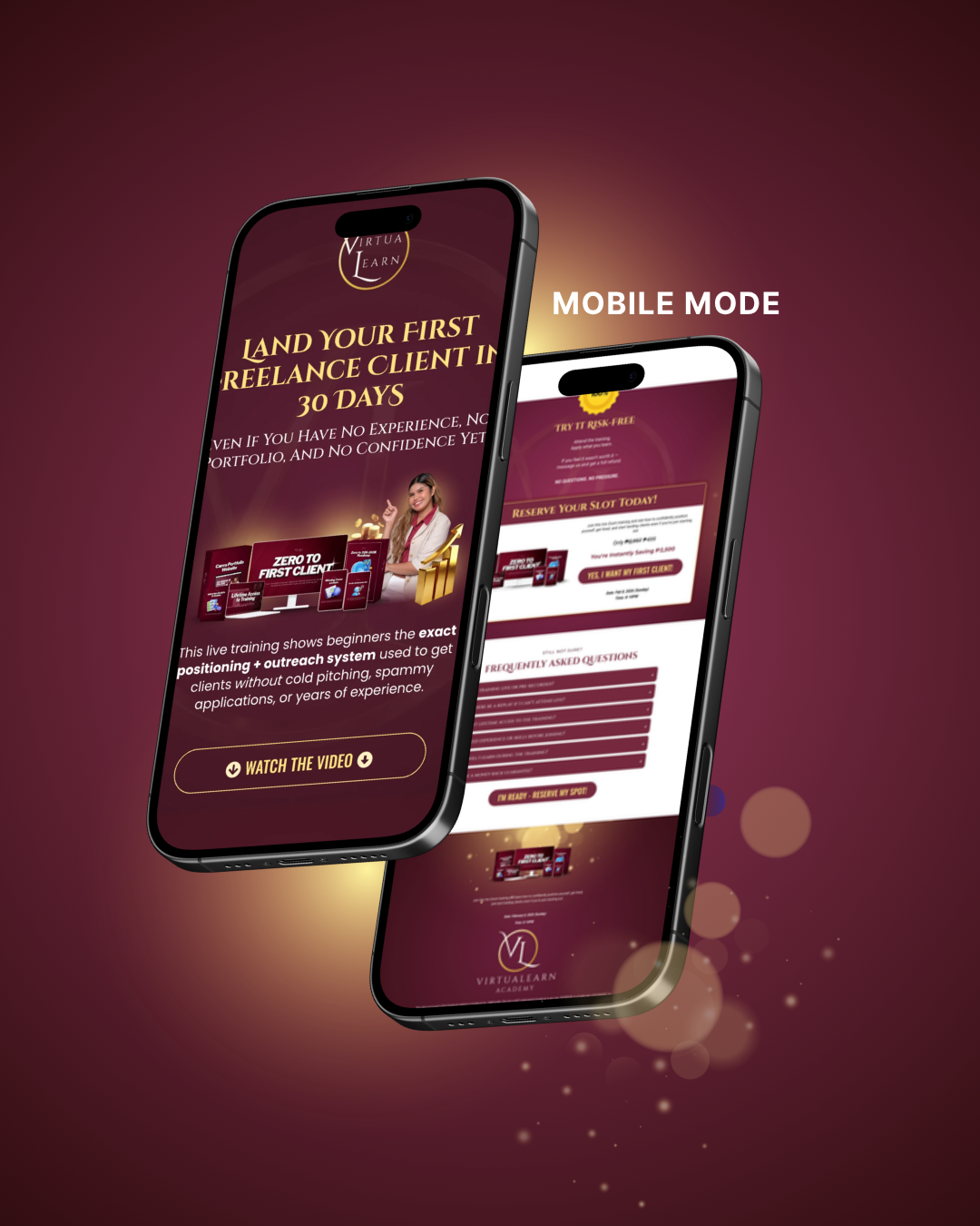
Mobile Mode: Native mobile experience with thumb-accessible CTAs, frictionless form access, and high-contrast typography.
Brand Guidelines & System Documentation
Every high-converting funnel requires lasting consistency. We documented the complete brand identity — colors, typography hierarchy, logo variations, button styles, and visual components — in the official VirtuaLearn Brand Guidelines.
Click the button above or below to open and review the full brand guidelines PDF.