MyStudio — Creative Studio Website Revamp
Turning a creative studio’s website into a clearer path from interest to inquiry for MyStudio Circulo Verde.

Project Focus
Client: MyStudio Circulo Verde Scope: Website strategy, messaging, design, and inquiry flow By: Krafted Lab
Project Overview
MyStudio has a space built for creators: a white cyclorama studio, equipment, and production support under one roof. Its website showed those capabilities, but it wasn’t doing enough to help visitors choose a service and take the next step.
The Challenge
The original site had a brand disconnect. MyStudio’s logo felt playful, energetic, and approachable, while the website leaned serious and editorial. Both directions had merit, but together they made the experience feel less cohesive than the studio itself.
The copy also had constraints. Much of the page described the space and listed what set it apart, while visitors had to work harder to understand which offer suited their shoot, what was included, and how to book. For a business receiving interest through Facebook and Instagram, that gap meant more questions and more manual follow-up before an inquiry could move forward.
The Strategy
We reframed the website around the decisions a potential client needs to make:
Can I create what I’m imagining here? What help can I get? What will it cost? How do I start?
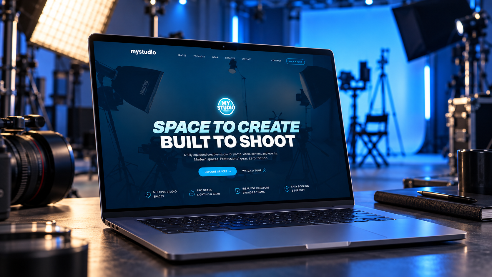
The revamp brought MyStudio’s visual personality forward with confident type, its recognizable blue, and a more energetic presentation of the studio. We paired that with clearer service descriptions, visible rates, relevant imagery, and calls to action throughout the page.
What Changed
We restructured the key decision points across the user journey:
- A stronger first impression: “Space to Create. Built to Shoot.” gives visitors an immediate sense of what MyStudio offers and who the space is for.
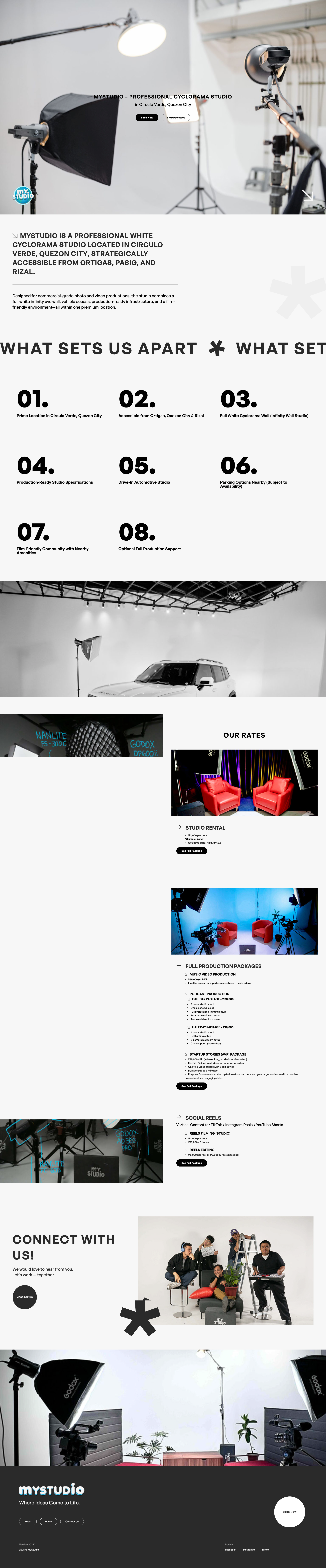
- Services organized around real needs: Studio rental, vehicle shoots, and production support are easier to find and compare.
- Less friction around pricing: Rate cards give visitors a useful starting point before they inquire.
- A clearer route to booking: Calls to action and the inquiry form help visitors move from browsing to sharing the details of their shoot.
- A more consistent brand experience: The new design carries the energy of the logo through the rest of the site, so the brand feels like one studio speaking with one voice.
The Outcome
The result is a website designed to do more than display a beautiful space. It helps potential clients picture their shoot, understand their options, and submit a more informed inquiry. It also gives the MyStudio team a clearer starting point for conversations that previously required more manual explanation.
The revamp is built to improve conversion, but a measured lift would require before and after inquiry data. The visible transformation is already clear: MyStudio now has a website that feels closer to its brand and makes the next step easier to take.
Krafted Lab: We kraft profitable brand systems for founders. Your Vision. Our Kraft!